Kickstarter Viz
| Posted June 3, 2019 |
►
Live Demo
|
| 0 Comments | Includes CSS, HTML, Tableau, Web development |
Did you ever want to start a Kickstarter campaign? Are you worried about the competition that you would face if you did? Did you want to know which types of projects are worth the time and money? Well, I’ve got quite the website for you to see before you start your journey on Kickstarter!
While I was attending The George Washington University, I teamed up with two classmates, Andrew Curtis and Robbie Auchter, on 2 projects. The first one was to create a Tableau dashboard using datasets that have enough data to tell a story. The other project was to create a presentation based on the first project. For the second project, we (Andrew and I) decided to develop a website to present our work. We used HTML, CSS, Bootstrap, and Animate on Scroll to make this website. For this article, I’ll walk you through each of the sections of the website.
Home Section
This is where the introductory section of the website is, which includes a brief description of what Kickstarter is and what the purpose of this website is. Andrew also added the green “K” logo, as a nice touch.
Popular Categories
This section shows what the different categories of Kickstarter projects are and which categories are the most popular. The top five categories are colored, while the other categories are greyed out.
Successful Campaigns
This shows the percentages of successful (and failed) campaigns within the top 5 categories, as well as the success and failure rates of the other categories combined.
A Goal to Succeed
This shows the average goal (in USD) of successful projects in each category to give users an idea of if they’re asking for too much money for their project or not.
Explore the Dashboard
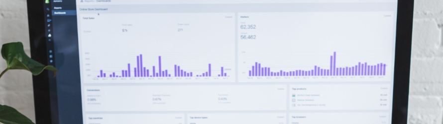
This one is rather self-explanatory. It allows you to actually interact with the Tableau dashboard that the three of us actually made.
Final Thoughts
This was a very well-made website, and I give thanks to both Andrew and Robbie for playing a part in the development of it. If you’re trying to view this website, I recommend zooming out using your browser’s settings, viewing it on a larger screen; preferably one that is a 15.6-inch or larger size screen, a screen with a resolution higher than 1920x1080, or one with a taller aspect ratio than 16:9, which is what most screens have right now (preferably 3:2).
Sources
Do you like the design of the website? What feedback do you have on it? Let me know in the comments below.